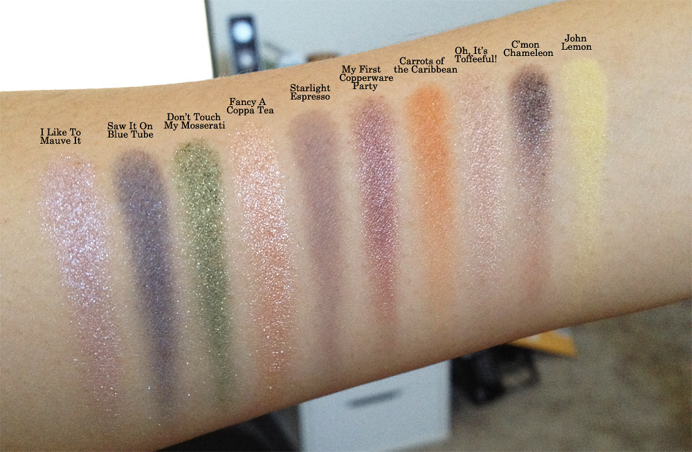
Thanks to the generosity of a dear friend, I was able to get my grubby little paws on some Catrice eyeshadow singles. I'd heard a lot about the brand across the internet, but as it's not sold in the US, hadn't had a chance to try until some international swappage occurred. :) This post serves mostly to document the shades and how they appear on my skin for future reference.
In order from left to right they are:
I Like To Mauve It
Saw It On Blue Tube
Don't Touch My Mosserati
Fancy A Coppa Tea
Starlight Espresso
My First Copperware Party
Carrots of the Caribbean
Oh, It's Toffeeful!
C'mon Chameleon
John Lemon
The pictures don't do justice to the duochrome C'mon Chameleon, which is a dupe for MAC Club. I've also heard said that Oh, It's Toffeeful is a dupe for the cult favorite Burberry Pale Barley, but I haven't tried the latter personally, so I can't attest to the truth of that statement. It is definitely a workhorse neutral lid shade, however, but would better suit those lighter in skintone than I, IMHO. The biggest standout to me is Starlight Espresso, which is a smooth grey matte that I definitely need to try as a "crease" (my crease and contour are not one and the same; I'm specifically referencing the lid fold here) shade sometime.
Sunday, February 9, 2014
Tuesday, February 4, 2014
Foundation matching for medium yellow-olive skintone
So after ages of living in denial, I decided finally to face the reality that lots of those nice foundation formulas I liked really didn't match me all that well. The reason this preoccupation entered my mind is that I'm looking for a good foundation for wedding photos and, as I'll likely be baring my shoulders and decollete, I super duper need my face to match my chest and neck. I gathered a bunch of samples along with the foundations I own and swatched them all on my inner arm, which is currently probably NC25-30 while my face in the fall is closer to NC35-37, but my neck and chest are a shade or two lighter and cooler yellow/more olive.
It used to be that foundations were all pink-toned, but now yellow tones are a lot more popular. However, they tend to be too orange/peach on my cool yellow/olive skin, standing out more starkly on me than some of the pink-toned foundations like Bourjois Healthy Mix 55. Also, keep in mind that my face is far darker than my inner arm and that these are all used in daily application far more sheerly than swatched here, so they aren't quite as ridiculously off as they look, though admittedly imperfect for the most part. This is the list swatched for reference: (Sorry about the bad cropping in the second image, but you didn't need to see my messy room! :P)
YSL Teint Majeur 7
D&G Perfect Finish Creamy Foundation in 120 Natural Beige
Laura Mercier Silk Creme Cashew Beige
Estee Lauder DoubleWear in 2w2 Rattan
Bourjois Healthy Mix 55
Missha Perfect Cover #27
Shu Uemura Nobara 754
Bobbi Brown BB Cream in Medium
Kevyn Aucoin Sensual Skin Enhancer SX-11
Givenchy Photo'perfexion in 106 Perfect Pecan
Giorgio Armani Luminous Silk 6.25
Giorgio Armani Luminous Silk 5.75
Giorgio Armani Luminous Silk 6
Chantecaille Future Skin in Camomile
Givenchy Teint Couture in 5 Elegant Honey
MAC Face & Body in C3
Stila CC Medium (this didn't swatch well as it stays green if it's not sheered out much, but then it's hard to really see without.)
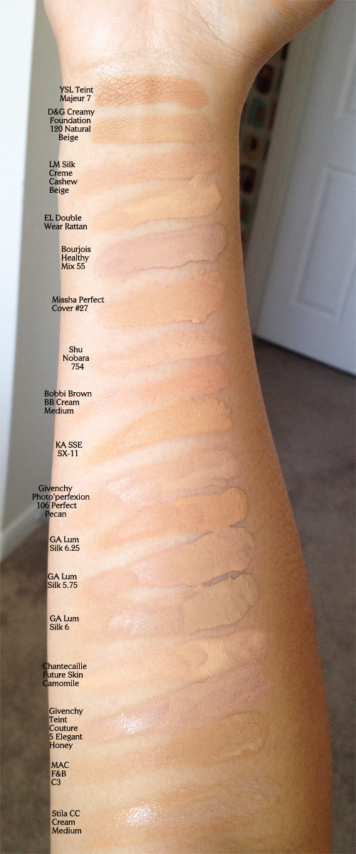
It seems to me that D&G Creamy 120 Natural Beige, ELDW Rattan, Shu Nobara 754, Givenchy Photo'perfexion 106 Perfect Pecan, KA SSE SX-11, GA Luminous Silk 6, Chantecaille FS Camomile, and MAC F&B C3 are closest undertonally to the green and/or cool yellow I want to reach, especially the exceedingly green Luminous Silk 6. This "experiment" really brought home what a dearth of olive foundations there are on the market, which is strange considering how many olive-y people there exist around my skintone. If you have any recommendations for medium yellow-olive foundations, please let me know!
It used to be that foundations were all pink-toned, but now yellow tones are a lot more popular. However, they tend to be too orange/peach on my cool yellow/olive skin, standing out more starkly on me than some of the pink-toned foundations like Bourjois Healthy Mix 55. Also, keep in mind that my face is far darker than my inner arm and that these are all used in daily application far more sheerly than swatched here, so they aren't quite as ridiculously off as they look, though admittedly imperfect for the most part. This is the list swatched for reference: (Sorry about the bad cropping in the second image, but you didn't need to see my messy room! :P)
YSL Teint Majeur 7
D&G Perfect Finish Creamy Foundation in 120 Natural Beige
Laura Mercier Silk Creme Cashew Beige
Estee Lauder DoubleWear in 2w2 Rattan
Bourjois Healthy Mix 55
Missha Perfect Cover #27
Shu Uemura Nobara 754
Bobbi Brown BB Cream in Medium
Kevyn Aucoin Sensual Skin Enhancer SX-11
Givenchy Photo'perfexion in 106 Perfect Pecan
Giorgio Armani Luminous Silk 6.25
Giorgio Armani Luminous Silk 5.75
Giorgio Armani Luminous Silk 6
Chantecaille Future Skin in Camomile
Givenchy Teint Couture in 5 Elegant Honey
MAC Face & Body in C3
Stila CC Medium (this didn't swatch well as it stays green if it's not sheered out much, but then it's hard to really see without.)
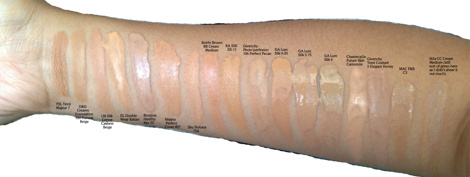
It seems to me that D&G Creamy 120 Natural Beige, ELDW Rattan, Shu Nobara 754, Givenchy Photo'perfexion 106 Perfect Pecan, KA SSE SX-11, GA Luminous Silk 6, Chantecaille FS Camomile, and MAC F&B C3 are closest undertonally to the green and/or cool yellow I want to reach, especially the exceedingly green Luminous Silk 6. This "experiment" really brought home what a dearth of olive foundations there are on the market, which is strange considering how many olive-y people there exist around my skintone. If you have any recommendations for medium yellow-olive foundations, please let me know!
Thursday, January 30, 2014
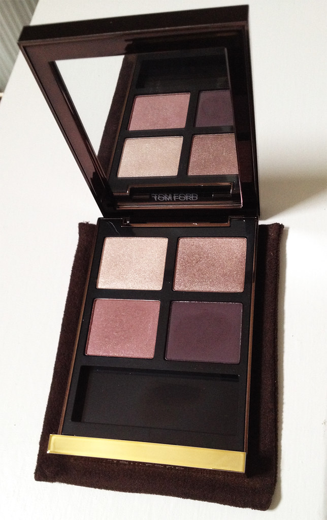
Tom Ford Orchid Haze and Silvered Topaz Quads
Thanks again to the lovely and awfully persuasive ladies over at MUA, I ventured into the wild world of Tom Ford. As his cosmetics line is not available anywhere near me (though his delicious fragrances, thankfully, are *swoons at the very thought of Tobacco Vanille*), I bit the risky bullet and ordered from Nordstrom, hoping that I'd like them. Reviews of his eyeshadow quads were mixed from the beginning but had improved as he introduced new palettes, so I felt that I needed to see for myself.
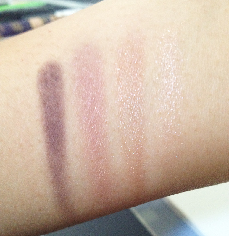
First up we have Orchid Haze:
Though it looks very rosy in the pan, those tones are muted down on my skin, especially depending on the placement I use. I would call it a neutral palette with a slightly rosy edge and find it imminently wearable. It is, after all, the number one candidate for my wedding eyeshadow right now. :)
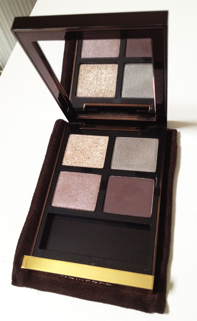
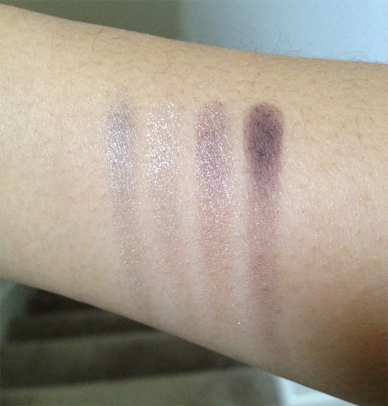
Second is Silvered Topaz:
I was apprehensive about this one at first because it seemed fairly cool-toned in online swatches that I'd seen, and I wasn't sure if I could pull off something so silver-based. However, once I received it and swatched, I was astonished by the fact that the color story seemed extremely similar to one of my favorite Suqqu quads, Ginbudou, with the gold glitter (it's hard to see the sparkly particles in the above swatch, but I assure you that it's a very smooth glitter), the silver shade, and the darker plum. Does this mean either will get purged? The answer is a vehement "NO!" for as any beauty junkie would tell you:
But, of course, do as I say, not as I do; I am extraordinarily weak-willed when it comes to purging. I am more than due for a blogsale, though, if I ever get my lazy bum out of this chair. *crotchety grumble*
Monday, January 27, 2014
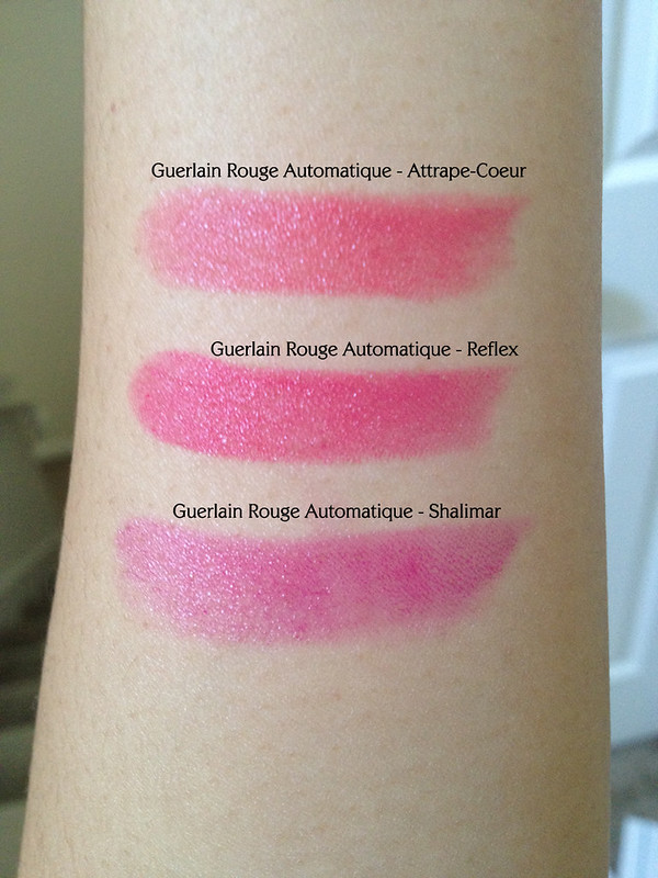
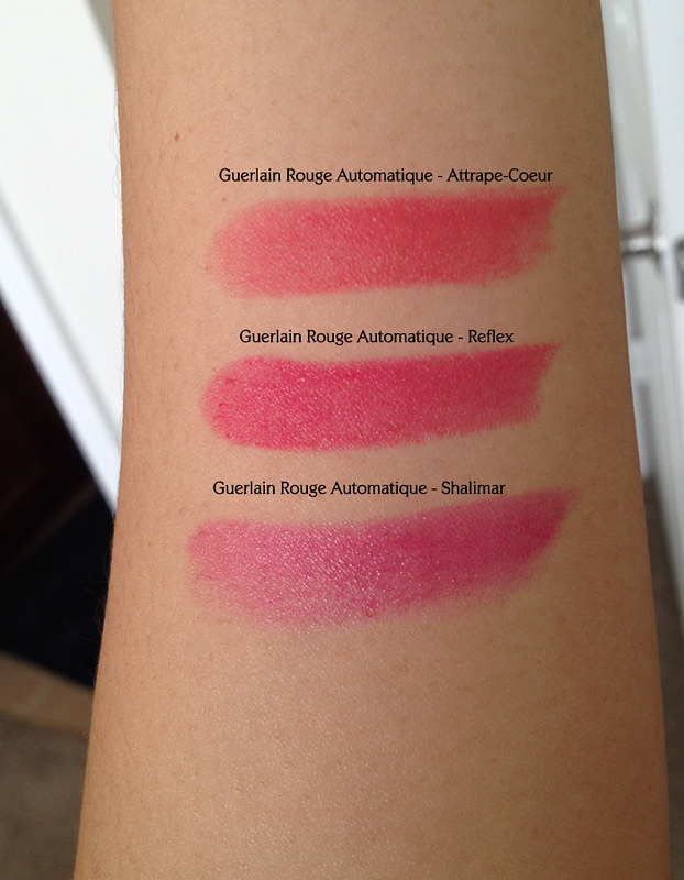
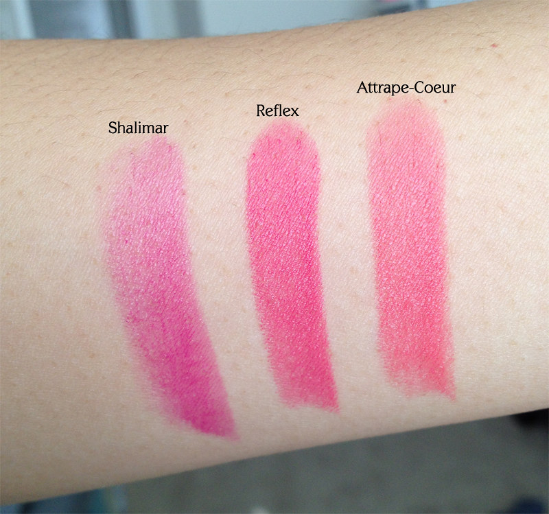
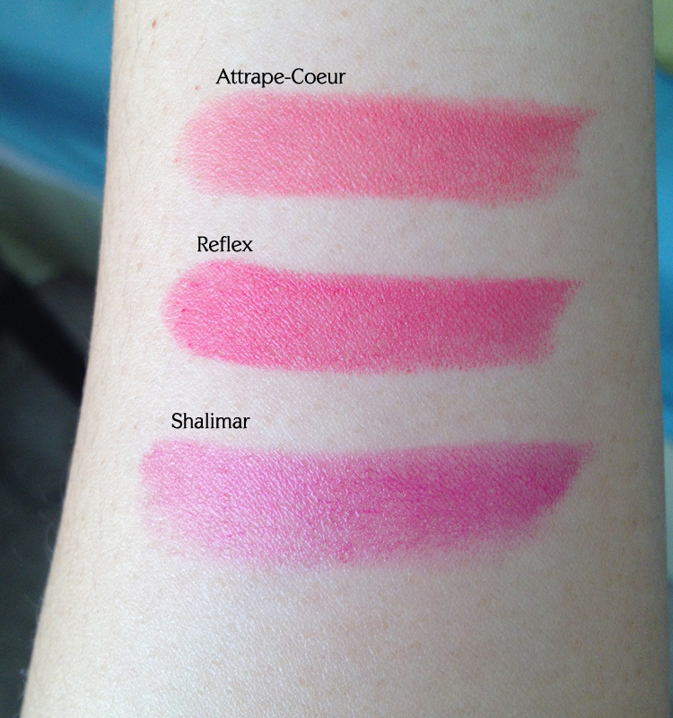
Comparison Post: Guerlain Rouge Automatique in Shalimar, Reflex, and Attrape-Coeur
Ever since Guerlain released Attrape-Coeur Rouge Automatique for spring, I've been drooling over it and finally decided to push the button. (Oh, alright, maybe it didn't take that much agonizing...) Once I received it, I realized that, like many other beauty aficionados, I tend to focus on certain types of shades (in my case: peaches, corals, and pinks), so I was afraid that the RAs I'd collected were too similar. Thus, a swatch-a-thon!
This is how they look in the tubes. At first glance, Attrape-Coeur and Reflex seem very similar, and Shalimar seems darkest. However, this is a lie.
When I swatched them next to each other, it was apparent that the newer RAs, Attrape-Coeur and Reflex, were far more pigmented than Shalimar (Reflex most of all!). These photos show Shalimar after three swipes whereas the others I only had to swipe once to achieve this level of opacity. Shalimar also has more of a clear base while Attrape-Coeur and Reflex sit on more of a white base. This is fatal to some's lemmings, but for me, I can tolerate somewhat of a white base in order to keep colors clear on my pigmented lips. Reflex is a slightly cooler, more fuschia/red pink whereas Attrape-Coeur is a corally pink, so they do indeed differ enough for me to keep both.
Here they are in different degrees of lighting, all indoor, however.
Hope this was helpful as you decide whether or not to splurge on Guerlain's Spring 2014 collection. :)
Friday, January 24, 2014
Giorgio Armani ETK quad 02 Terra Sienna
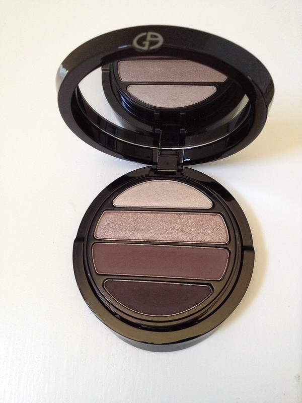
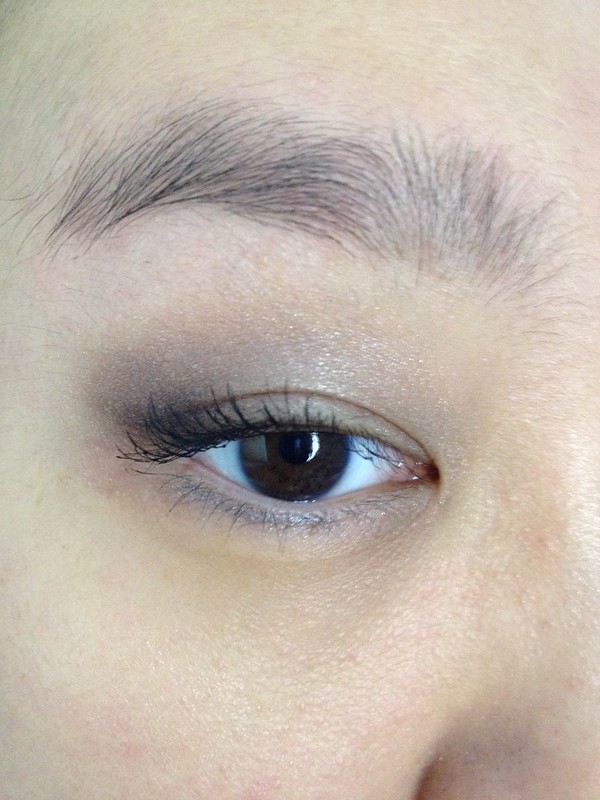
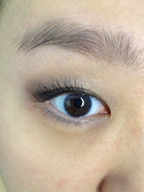
Thanks to some mumblings about the GA quads on MUA, I decided to try this product out. It seemed like a great neutral palette from what I'd seen online, and I liked the fact that it had a large range in terms of depth. The top two shades are shimmery and light while the bottom two are matte, far darker, and extremely pigmented. I was surprised at the depth jump between the 2nd and 3rd shades as I am more used to quads skipping in even intervals when it comes to depth. I was on the fence about this quad at first because the first look I did was subpar, in my opinion. However, I tried it again and really liked it.
Other products used:
BB Gel Liner in Black Ink to tightline
UD Mushroom pencil liner for bottom lashline
D&G The Eyeliner in White on waterline
CG Clump Crusher WP over Guerlain Noir G mascara
Wednesday, January 22, 2014
Givenchy Le Rouge swatches
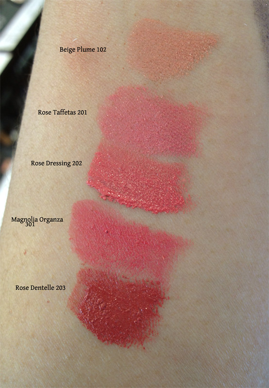
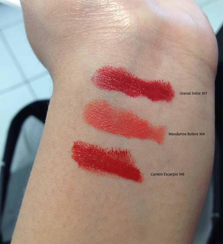
Givenchy Le Rouge is one of my favorite lipstick formulas as it is smooth and opaque, but not drying, with a gorgeous range of colors. Here are a few that I swatched next to one another for comparison.
Beige Plume, Rose Taffetas, Rose Dressing, Magnolia Organza, Rose Dentelle
Grenat Initie, Mandarine Bolero, Carmin Escarpin
Hope this is helpful to someone!
Beige Plume, Rose Taffetas, Rose Dressing, Magnolia Organza, Rose Dentelle
Grenat Initie, Mandarine Bolero, Carmin Escarpin
Hope this is helpful to someone!
Tuesday, January 14, 2014
A couple of Naked 3 looks
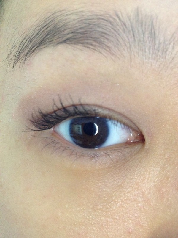
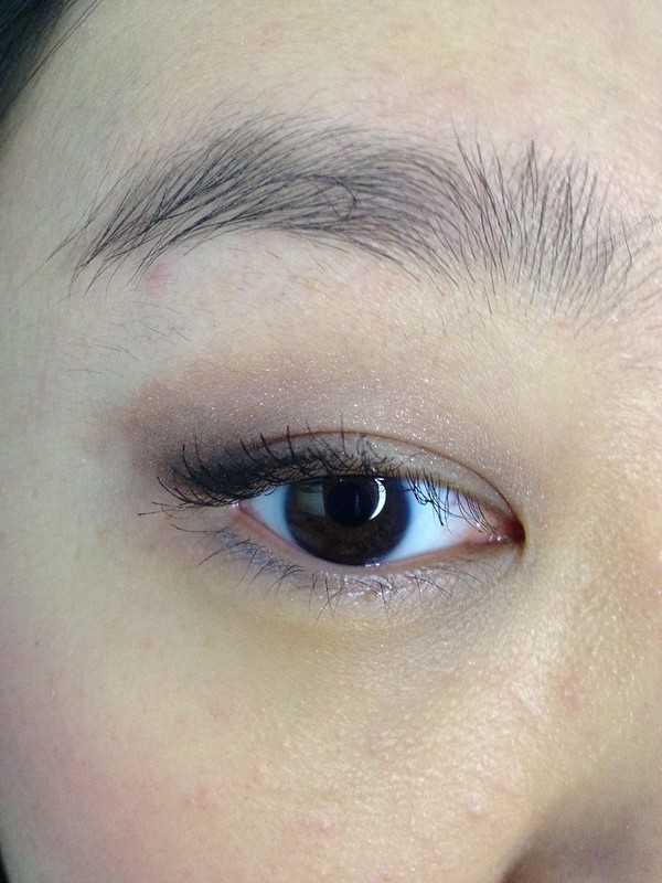
I recently purchased Urban Decay Naked 3 and really enjoy it. When I first heard that it would be rose-gold in tone, I was really excited as I am all about the pink tones. Turns out I was right! For reference, my skin tone is NC35-37-ish with olivey yellow tones, but I cannot for the life of me tell if I'm a warm or cool yellow as I feel like I can pull off both warm and cool colors. Perhaps a neutral? Anyway, on to the looks!
For the first one, I used Limit all over, Buzz for the outer half, Strange to highlight, Burnout in the inner corner, and Darkside to wing out around the lashline. Unfortunately my camera won't capture a lot of these subtleties. I also used Guerlain Noir G mascara and Essence London Baby to tightline.
For the second one, I used Nooner as an all-over base shade, Trick on outer lid, blended up, Mugshot on inner lid, Dust on middle of lid, Blackheart to wing out shadow just above outer lashline. (Yes, I have predictable placement. :P) Also used Kat von D Autograph pencil in Immortal Love for upper lashline, UD Mushroom liner for lower lashline (I know this doesn't match tone-wise, but I really like it on my lower lashline and wanted to play with it more), and Guerlain Noir G mascara.
All in all, it's a fairly subtle palette, at least on my skintone, as the rosiness is not overpowering. I like that there is a nice mix of finishes and that the shimmery shades aren't too frosty, a complaint of which UD is often guilty. I just wish a few shades were a little less glittery, like Dust, but I'm very happy with this product.
Saturday, January 11, 2014
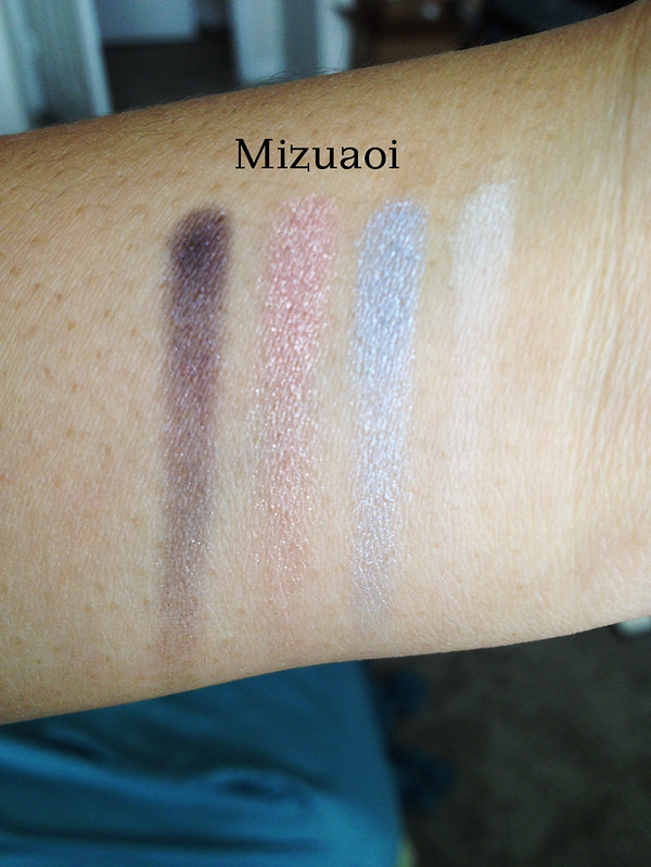
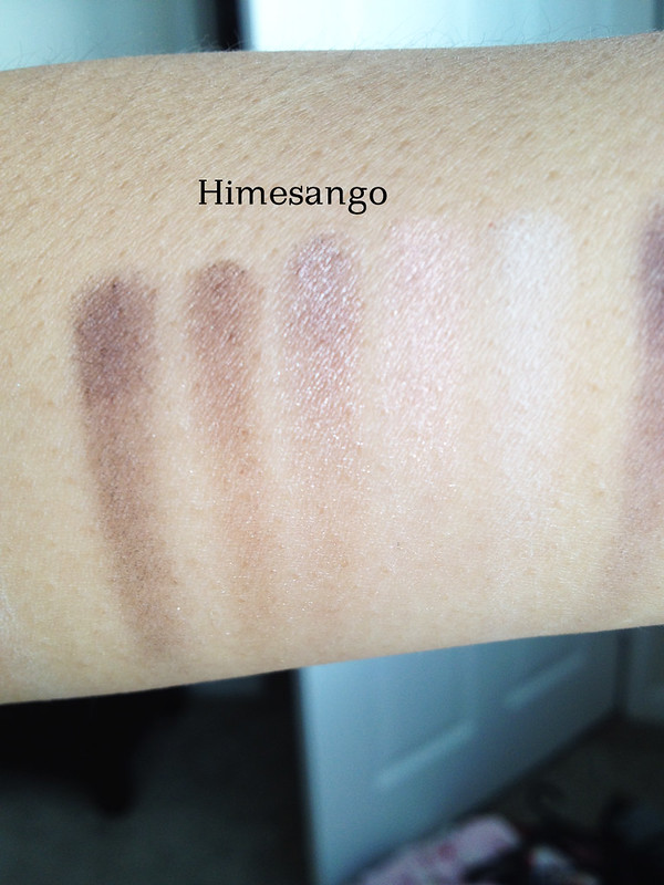
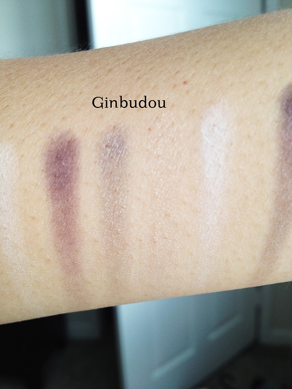
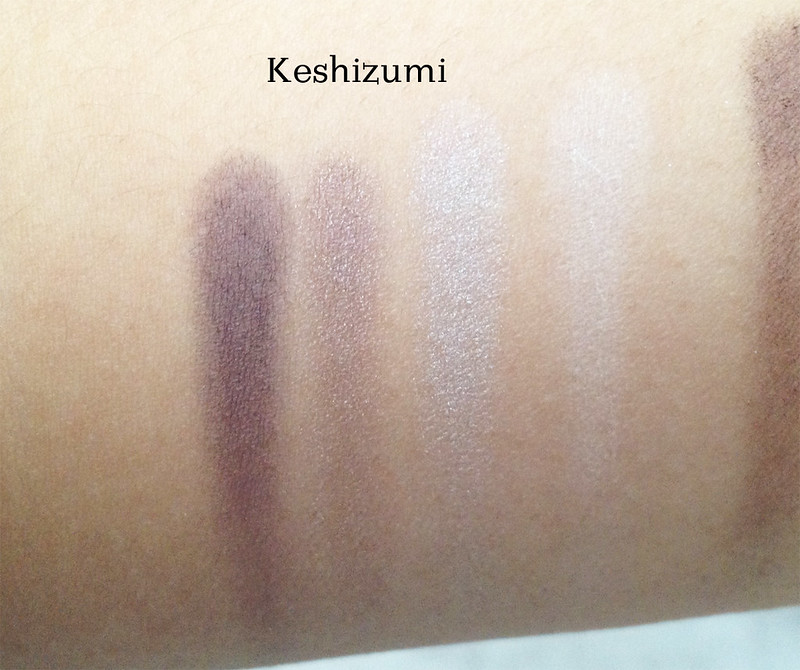
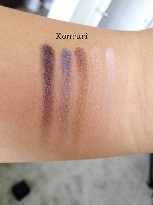
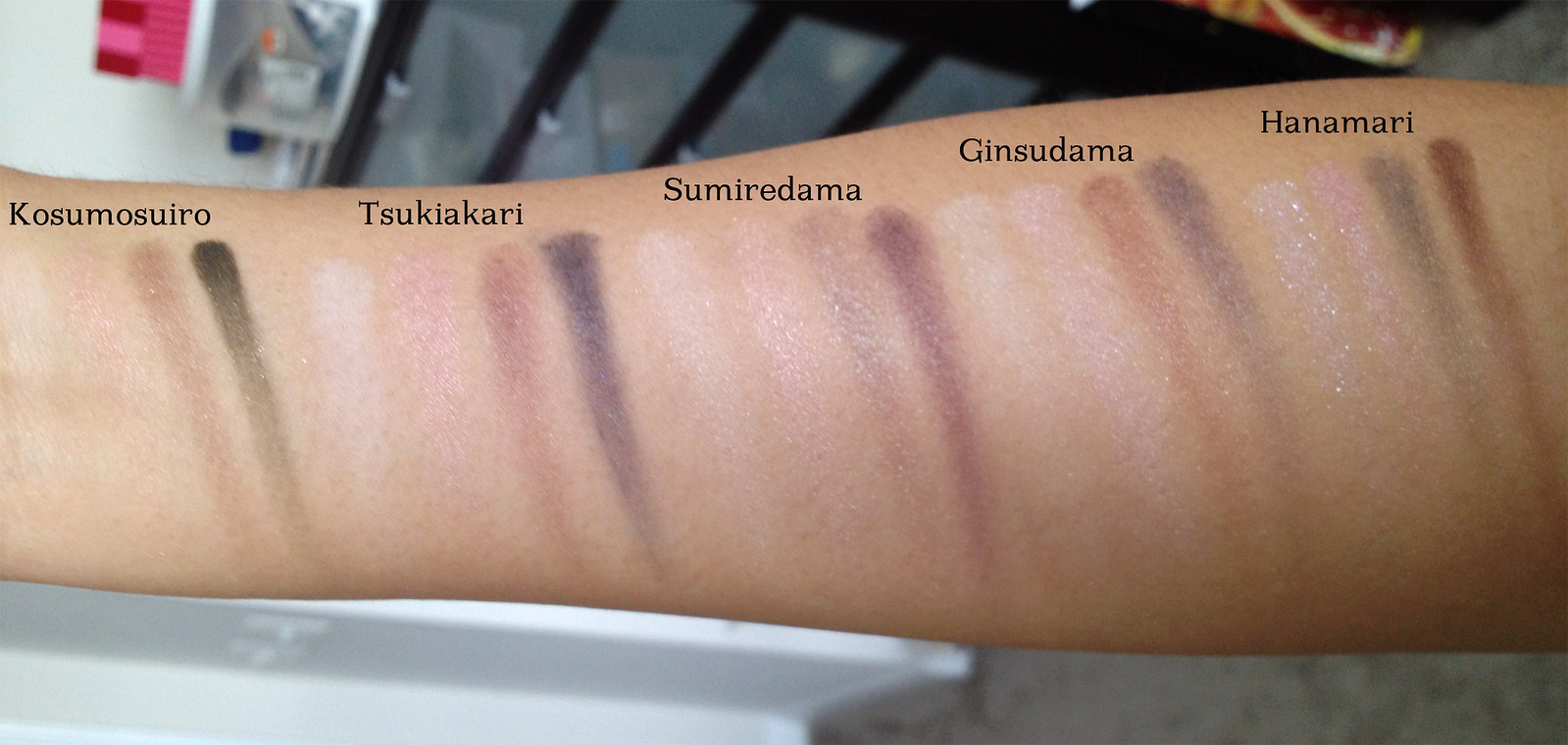
Suqqu stash and swatches
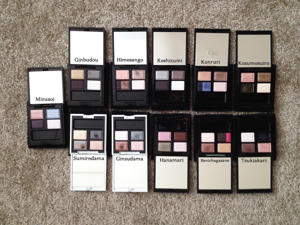
I wanted to start a swatching project of my stash to help me remember what things look like on my skin, to help purge, and to identify dupes and similar/complementary shades.
Mizuaoi
Himesango
Ginbudou
Benichagasane
Keshizumi
Konruri
Kosumosuiro, Tsukiakari, Sumiredama, Ginsudama, Hanamari
I definitely felt the difference in pigmentation between the older quads and the newer ones, but some of the older ones are so elegant and subtle. <3
Mizuaoi
Himesango
Ginbudou
Benichagasane
Keshizumi
Konruri
Kosumosuiro, Tsukiakari, Sumiredama, Ginsudama, Hanamari
I definitely felt the difference in pigmentation between the older quads and the newer ones, but some of the older ones are so elegant and subtle. <3
Subscribe to:
Posts (Atom)